Beautiful greeting card with a blank page is not the best gift for a loved one. Even a few words written from the heart or mentioning jokes that only two people understand will make the card special and bring even more joyful emotions.
But most often, postcards and cards remain empty for one simple reason - even the inscription "Happy Birthday" can be difficult to write both beautifully and originally. For those who have never encountered the art of lettering or drawing, there are font templates and simple master classes.
Features of creating stylish and eye-catching inscriptions
Creating a stylish font is a complex process that is often done by real professionals. That is why most advertising banners or Instagram Stories feature bright, original, and memorable inscriptions.
But when it comes to creating a handwritten inscription, many are at a loss and do not know where to start. This is where the art of lettering comes to the rescue – creating beautiful handwritten inscriptions.
Here are some simple tips on how to come up with an attention-grabbing caption:
- Stylistics is of great importance. If a postcard, card or gift in general has a certain theme, you can always style the congratulatory inscription to match it. It can be an old handwritten font, letters in the form of fruits, an inscription against the background of space, letters entwined with flowers.
- Color combinations will help to decorate any font. Even handwritten text, made with an outline or on a base of a contrasting shade, will look more voluminous and original.
- Combining different fonts or handwriting styles is a great move for larger texts. Words and phrases can be emphasized by their size, color, slant, script, and printing style.
- If you lack imagination, you can always try to repeat a font you like from the Internet or from an advertising image.
The most important thing in an attention-grabbing and stylish inscription is its mood and style, which become a complement or continuation of the text or idea itself.
Many people think that they will not be able to create an effective lettering, because they had problems with cursive writing at school. But cursive writing is more related to calligraphy, and although lettering originally appeared thanks to this area, it does not have such strict rules. But it is also not necessary to have special artistic talents - many nuances of creating text are obtained technically.
Another important point in writing beautiful texts is the tools used to do it. Of course, a person who is passionate about creativity will be able to create an ideal inscription with both regular paints and a ballpoint pen. But the better and more convenient the tools and materials are, the more confident and bright the lettering will look.
How to create your own inscription with a beautiful font in pencil
The beautiful inscription "Happy Birthday" will turn out perfect if you draw the font you have created with a pencil first. This method will help you not only not to spoil the surface of the card the first time, but also to "get your hand in" and try on the size of the inscription you have created.
In order for a pencil drawing to be clear, but at the same time easy to erase, it is important to observe several nuances:
- It is better to use a pencil of medium softness (HB or F), so it will be easier to erase the lines;
- the pencil must be well sharpened, the lead should not wobble or break during the drawing process;
- the thinner the lines, the less "dirt" in the final sketch;
- you can draw several lines at once with light movements one after another, and already at the stage of outlining or erasing unnecessary details, choose the most successful line;
- In order not to stain the sketch, it is important to hold your working hand correctly - resting your little finger in a free space will prevent you from “smearing” the lines with your palm.
Usually a preliminary pencil sketch is needed if the text is stylized in a complex direction or should be as voluminous as possible.
How to draw a volumetric graffiti with a congratulation in pencil:
- Graffiti usually uses the most streamlined, rounded fonts. You need to choose a lettering style that fits this pattern.
- The first step is to draw the outlines of the letters – they should create an “inflated” text and not interfere with each other.
- Graffiti where the letters fit tightly together looks great. When drawing with a pencil, it is easy to adjust the thickness of the letters and their distance with an eraser. It is important not to forget about the distance between two words (or draw them under each other).
- To give the inscription volume, it is necessary to add visual thickness to the letters. Neat lines seem to extend the "side walls" of the letters, and one must not forget about the rules of perspective.
- If the letters are rounded, then their thickness should also be streamlined. Each letter has a thickening in the same direction.
- The simplest direction for adding volume is along the right lines of the letters, from top to bottom.
- The side parts of the letters can be shaded darker, and highlights can be made on the foreground shading using an eraser. Highlights are formed in the most "convex" parts of the letters.
Later, the pencil drawing can be colored with either markers or colored pencils. It can also be left black and white if the style of the inscription allows it.
Colored inscription
The beautiful inscription "Happy Birthday" will definitely become even more noticeable if you add color to it. The general concept of the inscription will influence the choice of shades, but you should not forget about using convenient drawing tools either.
Watercolor lettering "Happy Birthday"
Watercolor is one of the most flexible paints, which even a beginner can handle. To use it, you may need brushes or aquabrushes (brushes with water reservoirs) if the text is small.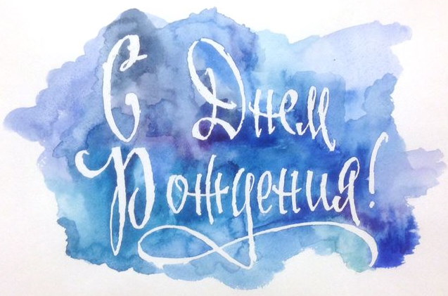
If the text is placed on a poster or any other large surface, you can use regular sponges for washing dishes - they are convenient for collecting paint from the palette and transferring it to the surface of the canvas. But here it is worth considering that for large inscriptions you need to choose watercolors in larger containers.
Options for painting text with watercolors:
- gradient of two different shades;
- with chaotic streaks of one color or different shades;
- with watercolor "spots" (can be done using salt);
- with splashes of different shapes and colors.
A beautiful colored inscription "Happy Birthday" can be drawn with an aquabrush in the classic lettering style - by hand, the left and upper lines are thin, and the lines on the right and on the bends are thicker. Thickening of the lines is achieved by pressing harder on the brush.
Signing a postcard with wax crayons
An interesting style of signing postcards is the use of colored crayons. They are most often used by small children, since crayons are comfortable to hold in their hands, their colors are extremely saturated, and they transfer well to paper.
The special style of applying chalk to paper allows you to make the text a little “childish” – write it by hand in large letters, paint it in all the colors of the rainbow, add a funny picture.
Congratulations inscription using markers
Thick and thin lines in lettering can be achieved not only with a brush. Markers with a flexible tip are another good option for quickly writing beautiful text by hand.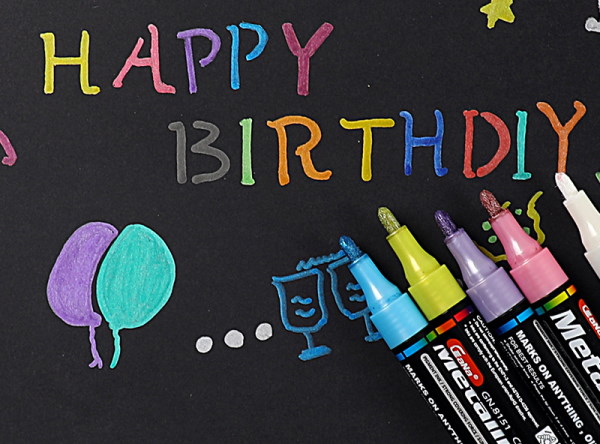
You can also use a marker or highlighter to:
- paint over the background of the text to make it stand out;
- outline the inscription with a pen;
- repeat the text of the inscription in a larger font and a less bright color, as if behind the main letters;
- add design elements to regular handwritten text – green leaves, cactus thorns, flowers, bows;
- paint the three-dimensional letters evenly.
The advantage of using a marker or a thick-tipped colored liner is that they allow you to make sloppy lines. Most often, stylized inscriptions with this tool look more interesting if you do not bring all the lines to perfection.
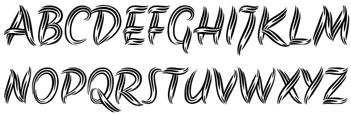
English handwritten fonts
Lettering in English is easier for beginners to do. In addition, you can find many beautiful and interesting examples of handwritten fonts for the inscription "Happy Birthday".
| English fonts suitable for lettering | |
| Alex Brush | A font with short ascenders and descenders, often used for classical lettering. |
| Arizona | This font has a distinctive feature - the use of thin and thick lines, as well as original decorative elements in the writing of some letters. |
| Sofia | Text written in this font is very similar to lettering with a regular brush and watercolor paints. |
| Dancing Script | The "dancing" font is very similar to the lettering style - bounce. It is the uneven baseline of the letters that gives this font that very handwritten charm. |
| Pacifico | A little vintage, a little cartoonish, this font is perfect for a signature on a postcard. |
| Playball | A font with rounded elements, small curls, thick lines, but more strict and masculine. |
| Yesteryear | The smooth and "flat" lines of this font go well with angular elements. Suitable for large, noticeable inscriptions.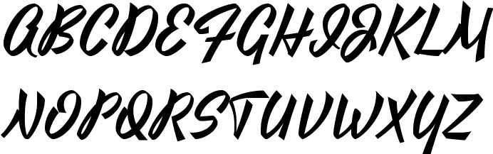 |
Using fonts for Photoshop and MS Word to better navigate the styles of inscriptions and the features of their drawing is a good option for those who do not want to study the features of lettering for a long time, but urgently need to create a beautiful inscription with their own hands.
Happy Birthday inscriptions in different styles and fonts
The beautiful Happy Birthday inscription will sparkle with new colors if you combine a handwritten font with an interesting stylization. Such a greeting can be used both on a postcard and on a large poster.
Some ideas for congratulations in different styles:
- Font Olympia Deco, stylization – cake and balloons. The inscription “Happy Birthday” can be placed on a symmetrical ribbon, on top of which draw a layered cake in a minimalist style, the upper tier of which is decorated with a crown. Three inflatable balloons of different sizes will look good on both sides of the cake, which will balance the composition.
- An angular Isserley font for the word "Happy" and a swirl-style Teddy Bear font for the word "Birthday". The severe lines of the first word can be offset by a drawing of a party hat above it, and the second word can be finished with a long curl.
- A handwritten font in the bounce style – Shink. It is easy to repeat the inscription in this font using a brush pen or a marker with a wide tip. Framed with flowers and other plant elements, such a greeting will create a mood of spring and lightness.
- The Top Secret print style is perfect for decorating a gift or card in the style of the X-Files. After cutting out the letters of the font according to the template, you can achieve the printed effect using a semi-dry sponge with a small amount of dye.
- The idea for an original inscription can be found in the Akronim font. By coloring the lines of the letters green, you can create plant motifs, and in red-orange coloring, the inscription will resemble tongues of flame.
Among the fonts on the Internet, you can always look for already stylized ones. For example, in the sections with unusual fonts, there are options with cookie-shaped letters, burning symbols, snow-covered or cartoonish letters.
Happy Birthday inscriptions in two lines
The arrangement of words in the greeting is also very important for the style of the inscription. It is easier to place "Happy Birthday" in two lines, adding decorative elements either on the sides of the inscription or directly between the words.
Variations of this spelling:
- "Happy" is a thin and elongated font, with two bold dots or asterisks on either side of the inscription. The word "Birthday" is written in a jumping style, a thick font with many rounded elements. The first part of the inscription is about half the size of the second.
- The first part of the greeting is written diagonally upwards (from left to right), it is better to use a handwritten, narrow font, but in the style of lettering. The second word should be larger and placed horizontally, a strict font with additional decorations inside the outline of the letters will do.
- The words "Happy Birthday" are written strictly under each other, all the letters are the same size. But the style of each letter should be different - for example, with different patterns, shades, stroke options. You can add a "jumping" effect when the letters are located at different heights.
The words "Happy Birthday" can be accompanied by "To you" in different variations. This part can be located below other words or between the main greeting.
Inscription templates
By choosing the right template, you can easily create a stylish inscription for congratulating a happy birthday. Each template can be modified to suit a specific occasion.
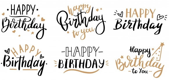
Various variations of the inscription "Happy Birthday" in 2 lines using different fonts and 2 shades, with additional drawings. The light part of the inscription on paper can be done with a metallic marker or glitter with gold sparkles. This inscription is suitable for decorating a card for both an adult and a teenager.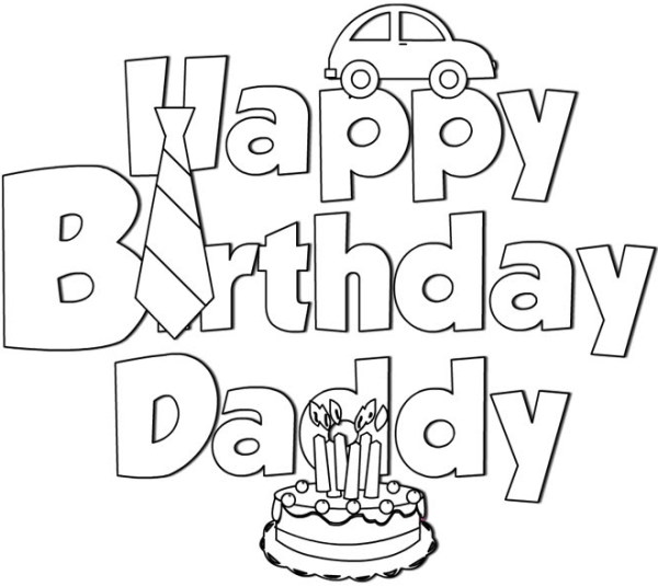
"Happy Birthday Daddy" is a congratulation option for dad. This inscription can be repeated by children from 6 years old, but a card in a similar style from adult children will also be a funny gift.
A similar version of the inscription for mom. A stylized heart can be used instead of any capital letter.
A birthday party-themed inscription is a great universal congratulation option. Minimalistic drawings are easy to repeat even for a child, and a lettering-style word is easily done with a brush or brush pen.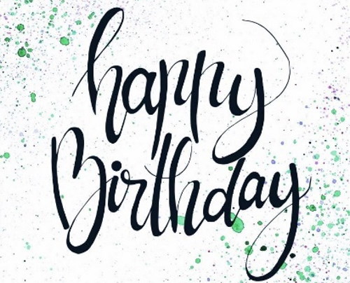
Another easy-to-do inscription – you can repeat it with a brush by hand, adding more sweeping rounded elements. The “highlight” of the inscription is the splashes of watercolor around it.
For those who have basic drawing skills, this version of congratulations will do. Instead of a cupcake, you can draw a cake with candles or a gift box. The same template can be used as a "transfer" on a clean sheet of paper.
It is easy to create a beautiful and original inscription with the greeting "Happy Birthday" using ready-made templates with drawings and decorations, as well as interesting fonts for web design. Any idea can be stylized for a specific purpose, using a little imagination.
Video about drawing the inscription Happy Birthday
How to write Happy Birthday: