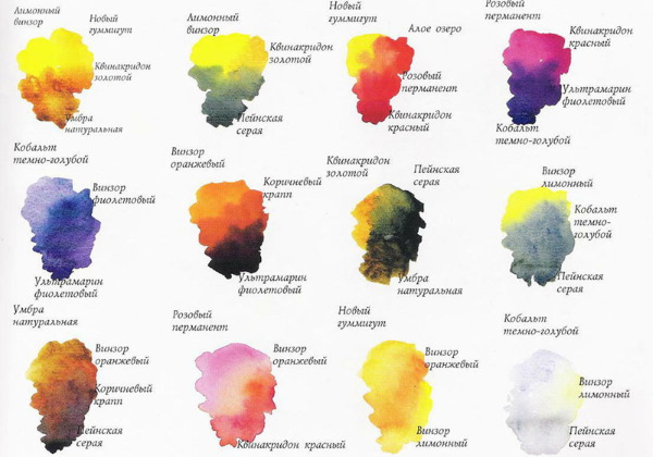
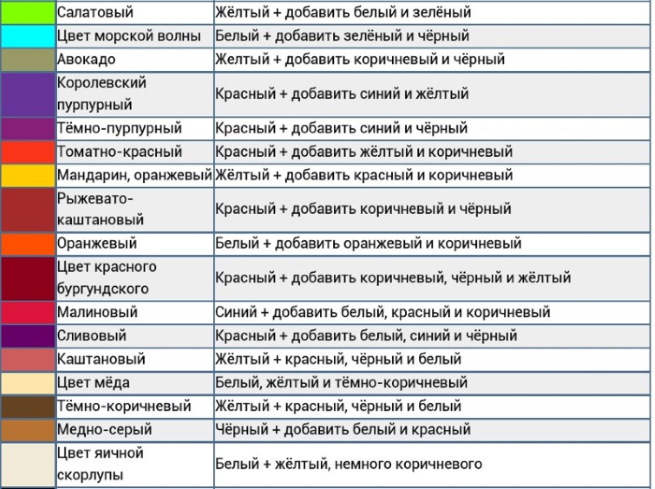
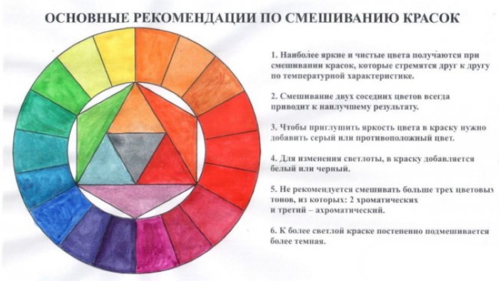
To get pure colors in creative art work, you need to know which paints can mix well and which ones form mud when combined. To do this, a color palette is collected. It takes time to collect it, but it is a good guide for beginners on how to get the desired color. Special tables can also be helpful.
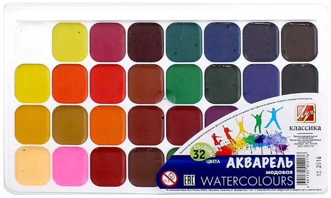
Watercolor
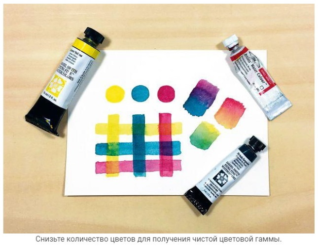
The most interesting part of working with watercolor paints is watching how transparent colors become more vivid after interacting with water on a sheet of paper. Using these paints, you can conduct various experiments, alternating different painting techniques.
Each watercolor color has its own unique properties and is used by artists to achieve different goals. A basic understanding of color theory and a standard palette will greatly assist in the practice of creating shades and experimenting.
Watercolor flower schemes are a variety of combinations from harmonious shades to striking compositions.
Mixing colors (a table of ready-made shades helps the artist in his work) or creating a limited color palette is the most convenient way to success in drawing. Using only a few different colors, you can create a huge range of possibilities.
Features of paint
One of the features of watercolor paints is that not all colors have the same properties. They differ from each other in the degree of transparency. The more transparent the watercolor, the more the surface of the paper sheet will show through the layer of paint. However, the color should not be made too saturated, otherwise the ability to layer the paint will decrease.
Another important characteristic of watercolor that every artist has to deal with is pigmentation. Watercolor paints are divided into 2 types: pigmented and non-pigmented. The former are difficult to remove from the paper once they have been applied, resulting in interference that is very difficult to deal with.
It is also worth taking into account such a characteristic of watercolor as lightfastness. It determines the duration of exposure to sunlight falling on the layer. Lightfastness also affects the rate of oxidation of the paint.
Temperature plays a huge role in creating a palette and choosing the right colors for a painting. Color temperature is the eternal opposition of warm and cold. Colors that are warm are characterized by activity. They are alluring and come to the forefront in the drawing.
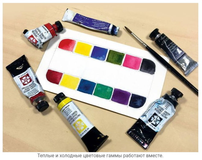
Cool shades have their advantages. Yes, they do not come to the fore, but they relax, refresh and dissolve very beautifully, being in the background.
Of the 6 primary colors on the color wheel, exactly 3 are warm, and the same number are cold. The division is 50 to 50, which once again indicates the eternal opposition of cold and warm.
The first 3 colors of the color wheel are warm. Consequently, all their possible versions will be the same. All color variants from red to yellow, being bright and inviting, are used mainly to create the foreground.
Their antipodes are the other 3 colors. All possible color variations from green to violet will be cold, respectively. They are often used to create backgrounds.
However, it is worth understanding that, in addition to this classification, which distributes colors into 2 main categories, there are also the concepts of “warmer color in relation to another” and “colder color in relation to another”.
For example, if you compare two cold colors - green and violet, the latter will be colder. In relation to violet, green will be a warmer color.
The same applies to bright colors, which according to the main classification are warm. For example, orange is warmer than yellow. Therefore, yellow, compared to orange, will be cold.
At first, the properties of watercolor paints seem incomprehensible. However, with practice, the artist begins to better understand what exactly needs to be paid special attention to.
Mixing colors (the table helps to understand the properties of shades and their main characteristics) helps to use a wide palette of shades.
The main colors of watercolor paint are:
| Color | Description |
| Prussian blue | A translucent, cool-toned watercolor. This color takes a little practice to apply well. The time spent will be rewarded by the gorgeous richness of this paint. Prussian blue will flow well over a surface if the artist applies it wet. However, it has serious limitations in layering due to its opacity. |
| Cobalt violet dark | This color is transparent. It looks great and gives good opportunities to get textures of the created drawing. However, this paint creates some limitations in work. It is difficult to distribute, but it can be easily removed from the paper sheet. After all, it is transparent. |
| Cadmium yellow medium | A low-pigmented semi-transparent color that is bright and has a warm yellowish tint. It looks good both alone and in combination with other colors. But only if these colors have sufficient transparency.
Because of the transparency of cadmium yellow, the artist working with it often has problems with layering. However, its saturation is sufficient that layering is not necessary. |
| Indigo | Transparent indigo paint gives depth to the color without muddying it. It gives the artist many possibilities. The only serious problem with indigo paint is that it is difficult to wash off. The artist has to come up with a way to eliminate accidentally left blots and other mistakes while painting. |
| Permanent pink | Transparent watercolor that spreads well. This color is very convenient to work with. Its spreading is easy to control, which significantly reduces the problems that can arise when mixing. Permanent pink reacts well with paper. And because it has transparency, it is often used for glazing. |
Mixing techniques
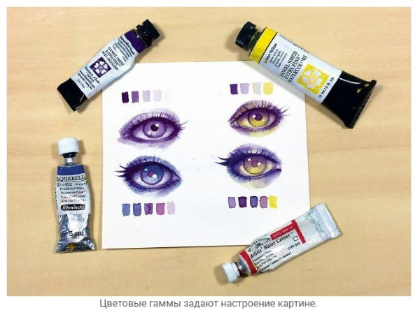
Before deciding on a palette, you need to at least understand the theory of color at a basic level and delve into how colors relate to each other. Then you can independently choose the appropriate ranges, for example, to evoke a specific emotion in the viewer or emphasize a particular artistic idea.
The main characteristics to consider when creating an artistic masterpiece are color temperature, hue, and purity. Hue is simply the name of the underlying color. In other words, hue is the location of the paint on the color wheel. The placement of colors here corresponds to their position in the rainbow.
The traditional palette includes warm and cool versions of the main shades. You should try not to use a large number of translucent and dark colors when collecting the palette, because they are difficult to mix and do not layer well. Warm and cool colors should work together.
The side of the palette with dark colors is located at the top. In the lower part, there are correspondingly cold shades.
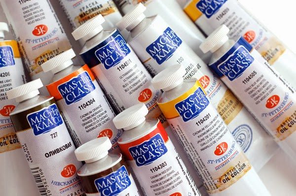
Oil
Along with watercolor paints, oil paints are often used by beginners and professional artists.
Features of paint
Oil paints are different from watercolors and have some advantages over them. However, they also have disadvantages. The main distinguishing feature of an oil base is its fluidity. To create a uniform color, you need to mix the shades thoroughly.
At the same time, this feature of oil paints helps to create additional artistic effects:
- when the paints are mixed completely, an even color is formed, which is suitable for both drawing and painting the surface;
- When the paints are mixed partially, the lightest or, conversely, the darkest particles of color will stand out in the base, which, when painted, will look like veins, which make the painting original and unusual.
Taking into account this feature of this dye, you can create unique decor.
Mixing techniques
In oil painting there are 3 main ways of mixing paints:
| Way | Description |
| Physical | In this case, the oil is simply mixed to obtain the desired color. Then the mixture is applied to the surface of the canvas. |
| Labor intensive | The gist of it is this. First, apply some color to the canvas. Then you have to wait until the paint dries completely. After that, apply transparent paint on top of the dried layer. You can also use translucent paint. After all these procedures, a new shade is formed. |
| Creating an illusion | When working with this technique, you need to place brush strokes close to each other. |
Anyone who wants to take painting seriously is advised to master all the methods of blending.
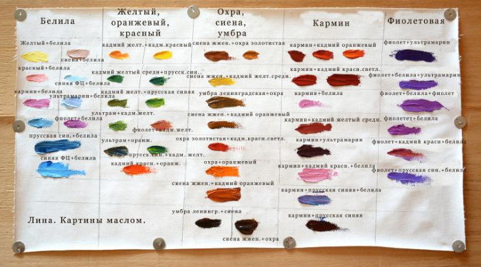
Mixing colors (a table of their options is available to artists) of oil paint must be done by adhering to the following recommendations:
- preparation of the color on the palette should be carried out immediately before use;
- a brush or a special swab is used to apply the strokes (it will be difficult to correct any mistakes made);
- every time after applying one layer of oil paint and before applying the next one, you need to wait until the previous one is completely dry (the exception to this rule is when the artist uses the partial mixing technique);
- When the color changes, the brush must be thoroughly washed with solvent.
Gouache
Gouache is a paint that is great for beginners. One of its main features is the high proportion of pigment and filler contained in the composition. As a result, the substance is completely opaque.
Features of paint
The color that gouache gives is stronger than that of watercolor. The applied layer of gouache dries quickly on the surface, after which it becomes slightly lighter. And this property of this type of paint must be taken into account by artists.
Mixing techniques
You can mix colors when working with gouache using one of the techniques presented in the table:
| Way | Description |
| Mechanical | The colors are simply mixed on the palette. |
| Optic | A new layer is applied to the already dried paint. The main thing is that the 2nd layer, which will be located above, is transparent or translucent. |
| Spatial | This is essentially one of the varieties of the optical method. In the color wheel, colors that complement each other are at different ends of its diameter. When optically mixing a pair of non-complementary chromatic colors, a new tone is formed. In the color wheel, this tone will always be located between the two colors being mixed. The resulting colors will be less saturated than those that were mixed. The greater the distance between them on the color wheel, the less saturated the mixture. |
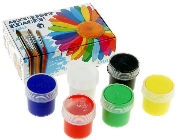
Acrylic
Acrylic is a great choice for beginning artists. These paints produce colours with particular saturation. Many people also like that they take a little time to dry.
And another important advantage is that they can be used when painting on almost any material, without worrying about the fact that this can negatively affect the quality of the finished painting. Paper, stone, glass, ceramic, wooden surfaces - all of them are suitable for applying acrylic paint.
Features of paint
Water-dispersible acrylic paints. Their consistency is similar to paste. They can be diluted with regular water or a special substance. Or you can do without dilution and use them as they were purchased. In any case, an even layer will form on the surface, which is durable and long-lasting.
Acrylic does not emit a strong odor, as is the case with many other paints. When working with it, there is no need to use thinners. This means that even children can use them for painting.
Using acrylic in painting, you can achieve incredibly beautiful effects. But it should be understood that these paints are divided into several varieties depending on the substances they contain.
For example:
- matte paints do not create a shine;
- glossy acrylic, on the contrary, promotes the appearance of a shiny surface;
- Fluorescent paints contain a special pigment that has the ability to emit light in the dark;
- thanks to the mother-of-pearl paints, a layer is formed that refracts the sun's rays, like real mother-of-pearl;
- Acrylic with a metallic effect creates an imitation of metallic shine, because it contains aluminum powder dye.
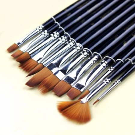
In addition to the paints themselves, you also need to select the brushes that will be needed to work with them.
It is recommended to pay attention to the following types of brushes:
- synthetic;
- bristle;
- with hard bristles.
Soft brushes made of natural materials are not suitable, since acrylic is a heavy substance. The strokes when using them will be shapeless. It is recommended to acquire 4 brushes of round and flat shape, differing in diameter. Also, a palette knife should be prepared for work.
Mixing techniques
Mixing colors (the table can be made independently) of acrylic paints requires preliminary study of their dilution. For this purpose, not only ordinary water can be used, but also a special substance called a thinner.
If paints are diluted with ordinary water, it must be clean and not warm.
The properties of acrylic will change depending on the ratio in which it is mixed with water:
- if the mixing is 50/50, then the resulting mixture is perfect for creating the first layers. Water will make the paint even more fluid. Consequently, it will lay well on the surface without accumulating on the brush bristles;
- when mixed in a ratio of 1 to 2 a paint is formed that is well suited for application to already dried layers. Its main features are uniform distribution and formation of a smooth coating;
- if you mix paint with water in a ratio of 1 to 5, then the resulting mixture can be used for glazing. Acrylic will help to form a strong translucent layer, since the pigment freely passes into the pores of the surface. By the way, even special thinners are not able to give such an effect;
- if it was decided to use something other than water to dilute the paint, but substances specially designed for this purpose, then you need to act according to the instructions. It is difficult to give general recommendations here, because each company produces thinners using its own technology.
The main disadvantage of thinning acrylic paint with thinner is that the paint may lose its homogeneity. There may be undissolved lumps left in it. After diluting paints with water or thinner, the number of available colors will not increase. New shades can only be obtained by mixing different paints with each other.
In general, acrylic is usually mixed using the same principle as oil paints. The idea is this: first, you need to take a little of one and a little of another color, and then simply mix until a uniform shade is formed. Special tables can help in combining colors in the right proportions.
Another mixing technique is to apply the 2nd layer on the 1st, which has already dried. The layer that will be located above should be transparent. This is how you can achieve an unusual effect: the main layer, which is located below, directly on the canvas, will shine through the top layer.
However, this mixing method is not very suitable for beginners, because its use is impossible without certain skills and knowledge of glazing techniques.
As for the volume of mixed color, the following rule applies: “it is always better to take a little more than you might need for the job.” In this case, the artist will always have the opportunity to correct any existing flaws after the applied paint has completely dried.
What paints should not be mixed
There are 3 basic colors from which you can get any other. The basis of everything is red, green and blue. By using them in different proportions, and then using the resulting mixture, you can create more and more new shades.
However, some mixing options may produce poor results, such as:
- if you mix lead white and ultramarine (or cobalt), you get an unsightly gray shade;
- an undesirable option is a combination of lead white and violet madder. In this case, excessive lightening is formed;
- It is better to avoid mixing natural paints based on drying oil with artificial substances. The result is impossible to predict;
- mixing dark purple ochre with lead white also results in lightening;
- If you mix Neapolitan yellow paint with other tones, you will get an excessively light shade.
Even a novice artist can create a beautiful painting if he follows the advice, takes into account the characteristics of each type of paint, and experiments with mixing colors, both with and without the help of tables.
Video about color mixing
Color mixing chart: